BELOW: An overall picture of the environment from Yin's side. The entire environment was made very large for the purpose of illustrating both clients' power through grandeur. Here you can see both elevators arriving at the meeting space.
Environment from Versace's side.

BELOW: View of Zhang Yin's office space from the outer corner. Her office was largely inspired by her profession, as well as by Steven Holl's extensive use of box forms in his architecture. This is reflected in the simplistic form of the space, her actual office area being the shape of a box and enclosed by numerous box forms. It is embedded into the bridge so as to remain slightly hidden, which I feel is symbolic of Yin's modesty. In this image you can also see the glass mover which brings you down from the player start into the office, as well as her own elevator which moves to and from the meeting space.

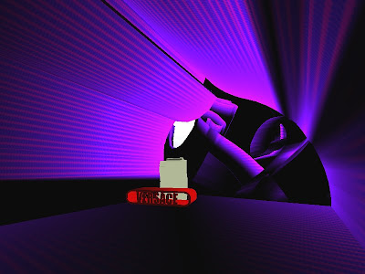
BELOW: An interior shot of Donatella Versace's office. This space was intended to reflect Versace's immense power as well as loud persona, appearance, image and ego. I have achieved this in the use of extremely bright clashing colours for her office, in combination with a crazy form at the back of it, at the same time avoiding just the simpler flat back wall seen in draft 1. Her office space, like Yin's, is massive in every way, screaming power in every aspect of it. The large curvy form behind her desk and chair (custom made) has a subtle 'V' shape, illuminated by lights surrounding it. This 'V' along with the posters of models showcasing her clothing, as well as her throne-like chair and boldly lit up desk each mirror her egotistical and proud persona. Her elevator, containing a large image of herself as the backdrop is also representative of this (see note at end of post).

BELOW: The meeting space. The stone exterior with a rather complex form makes it difficult to see inside the space from the outside. This was intended to convey what I imagine would be a huge clash when the two power's would meet, from both a cultural and personality point of view. Thus a sense of uncertainty is created in approaching the meeting space, which is relieved once you have entered it; it is very open allowing a lot of air and sunlight into it. The dining table was inspired by both clients, in an effort to create an equality between them despite their differences. It is large, long and thick in form and heavy in appearance, so as to reflect the weight of their power and influence. The chairs with high backs are also intended to represent their power making them, like Donatella's office chair, throne-like in appearance.
 Note:
Note: There was a problem with my elevator for Versace, looking at it from different angles, you are unable to see all sides of it at the one time. I tried numerous times to overcome this by remodelling it, re-importing the static mesh from SketchUp, reapplying textures, changing the positions of the mover but it proved to be the same each time. You will see what I mean once in the environment. I have posted 2 SketchUp screenshots of what iit is meant to look like as a whole in the post entitled "Versace's elevator".


 Update, Friday 20th June: I was unable to resolve the problem mentioned in the post "FINAL IMAGES". In any case, with Versace's elevator I intended to reflect her power in its size, the large picture of herself on the back of it, as well as a comfortable couch for her to sit on once inside it! The shape is an exaggerated figure of a woman, which clearly conveys a sense of empowerment. The elevator itself moves quicker than Yin's so as to show a contrast in personalities; Versace's is quite loud and over the top, whereas Yin is a more quiet and modest persona.


